The Design Systems Team maintains and publishes Figma libraries which contain foundational styles, components, patterns, and icons.
For documentation around broader Figma best practices within HashiCorp design teams, reach out to the Design Ops team or visit the #design-ops slack channel.
Enabling Helios libraries
Open the Library modal via one of the following methods:
- Click the
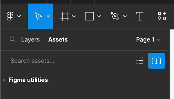
Assetspanel in the left sidebar, then click thebookicon to open the modal.
- Click the
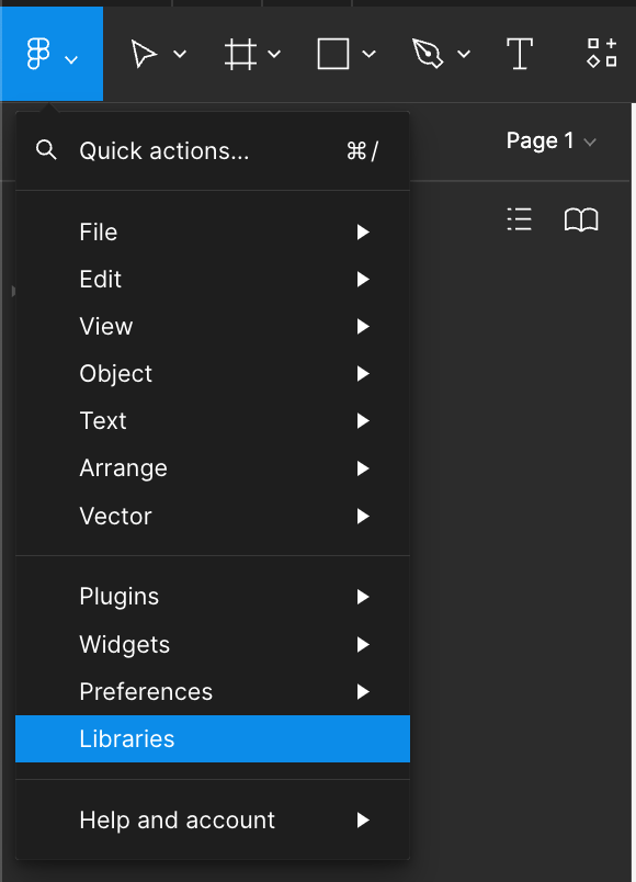
Figmaicon in the top toolbar, then click "Libraries".
Or use the keyboard shortcut:
- Mac:
⌥ option+3 - Windows:
alt+3
- Mac:
- Click the
Enable the libraries by locating the HDS Design System UI Kit team and toggling on the following:
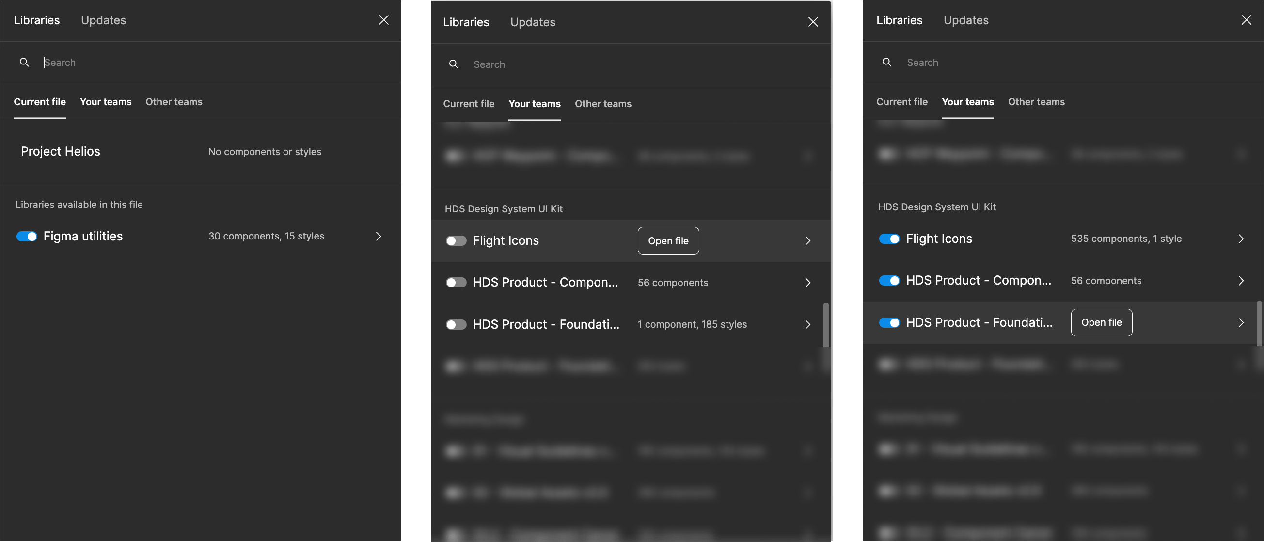
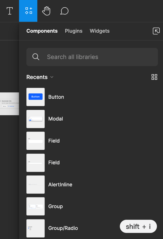
Once the libraries are enabled, you can access the components from the assets panel or via the resources menu (shift+i) in the toolbar. In contrast, styles published by the Foundations library are available in the design panel within the right sidebar.
Foundational styles
Styles, sometimes referred to as Tokens, allow consistent application of color (as a fill or stroke), typography, and effects within Figma. You can find these in the Product Foundations library.
Because the usage of Helios Foundations reinforces consistency across the products, we don’t recommend detaching from these styles within your designs.
Using styles in your project
Select the object(s) to which you want to add a style (e.g., text layer, shape, or frame).
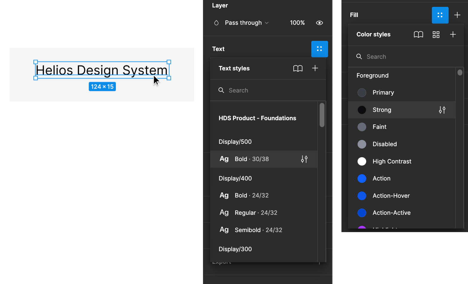
In the properties panel, click the style icon (looks like four dots) next to the appropriate property (e.g., text, color, stroke, or effect).
Select the style you wish to apply from the list of options. Ensure you choose styles within the HDS - Product Foundations library.
To learn more about how to use the foundational styles, visit:
Icons
Adding icons to your project
To use icons within your project, first ensure the Icons library is enabled for your project (see enabling Helios libraries).
Open your project file within Figma.
Navigate to the assets panel by clicking "Assets" at the top of the left sidebar.
Search or scroll to find the icon you need and drag it into your file.
Components
A component inserted from a library into a project is called an instance. Instances maintain a link to the main component in the library, which has significant benefits for deploying updates and iterating quickly on designs.
Adding components to your project
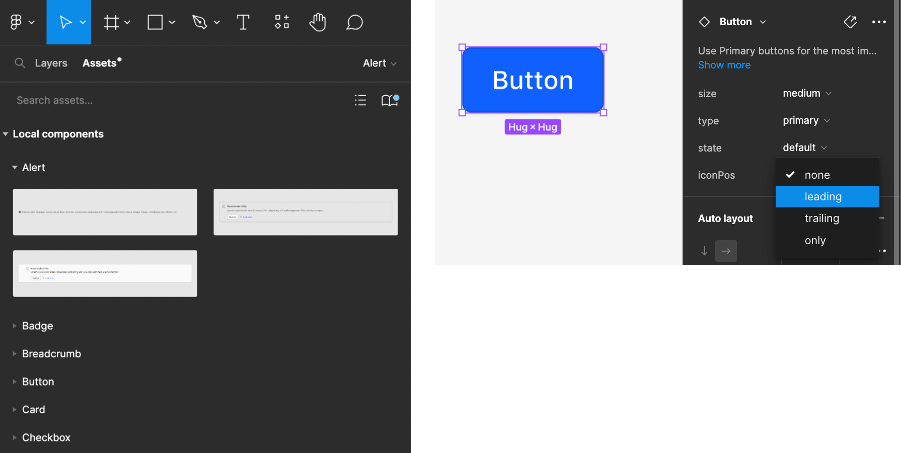
Add Helios components to your design project by inserting them directly from the assets panel or resources menu or copying the component from the stickersheet and pasting it into your project.
Inserting from the assets panel
Open the assets panel by clicking "Assets" at the top of the left sidebar.
Scroll through the list or use the search feature to locate the component you’d like to use.
- Figma’s search feature returns results based on the component’s name, category, and description.
Click and drag the component into the canvas or frame.
Configure the component properties as necessary in the right sidebar.
Inserting from the resources menu
Open the resources menu (shift+i) in the toolbar to expose a list of recently used components, plugins, and widgets enabled in your project. Use this method to access your more commonly or recently used components quickly.
Copying from the stickersheet
If you prefer to select a component visually, the Product Components library has a stickersheet for each component displaying the available variants and properties. Just like when using the direct inserts, this method maintains the link to the main component in the library, which means it will receive updates as they become available.
Open the Product Components library.
Navigate to the relevant component page.
Select and copy the component variant from the stickersheet.
Navigate back to your project file and paste the component wherever needed.

Working with components
Detaching components
Our Figma components are tightly coupled with their code counterparts to maintain API and design language consistency. Therefore, we don’t recommend detaching a component from the library in most scenarios.
When you detach a component, it no longer receives updates from the library, which can cause designs and production applications to drift out of sync quickly.
Contact the Design Systems Team for support or to request a new component if a component doesn’t meet your needs.
Overriding component styles
While you can technically override the styles within a component without detaching it, we recommend against doing so without consulting the Design Systems Team first.
Changing a component's color or font size may seem simple, but this can have trickle-down effects in code. Overriding styles forces engineers to create custom classes and styles to implement the changes. Overriding styles can have unexpected long-term effects within the CSS cascade and lead to tech debt. In addition to being difficult to scale, overrides nudge the design language of your product out of sync with Helios and the rest of the HashiCorp product suite.
Resizing components
Helios components are built to be layout-agnostic, meaning laying out components in a design is left to the consumer.
Unless specifically mentioned in the documentation, the implemented component will fill the parent container. For designers, it’s helpful to use auto layout wherever possible. Auto layout closely mimics CSS Flexbox and other browser layout mechanisms. Setting a Helios component to fill container within an auto layout frame typically replicates the experience of a development environment.
Designing local components
Components and patterns unique to your product should be designed and built locally, extending Helios components and foundations.
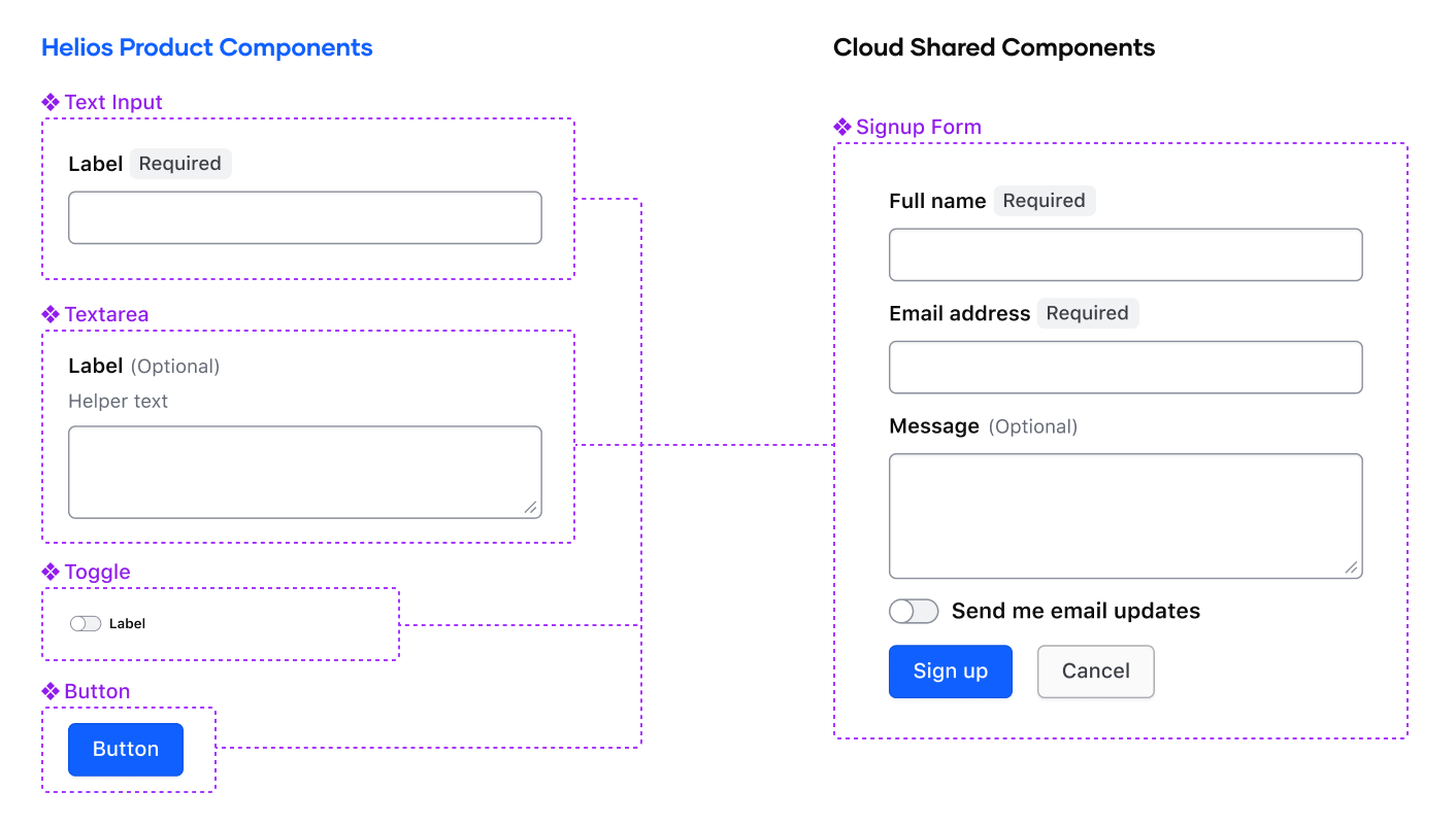
When creating local components for your product, it’s helpful to separate them from your main project files and house them in their own Figma library file. Using a dedicated library creates a consistent location for your product’s local components so that other designers on your team can access and use them.
Resources
Helios Figma libraries
HashiCorp product teams can use the Helios libraries published under the HDS Design System UI Kit team within Figma.
- Product Components: the set of components published in the Helios Design System
- Product Foundations: core styles including typography, color, and elevation that are consumed by Helios components for reuse in your projects
- Icons: core icon set for reuse in your projects
Recommended plugins
We don’t recommend tying core design functionality to third-party plugins because Figma doesn’t directly supported them. That said, we find the following plugins to be useful support mechanisms:
- Lorem Ipsum: generate varying lengths of placeholder "lorem ipsum" content in a text layer.
- Stark: a toolkit for measuring accessibility criteria in your designs.
- Super Tidy: bulk rename, reorder, and reorganize layers, frames, and other elements within Figma.
- Flyover: showcase your designs with smooth animations in a presentation-like format.
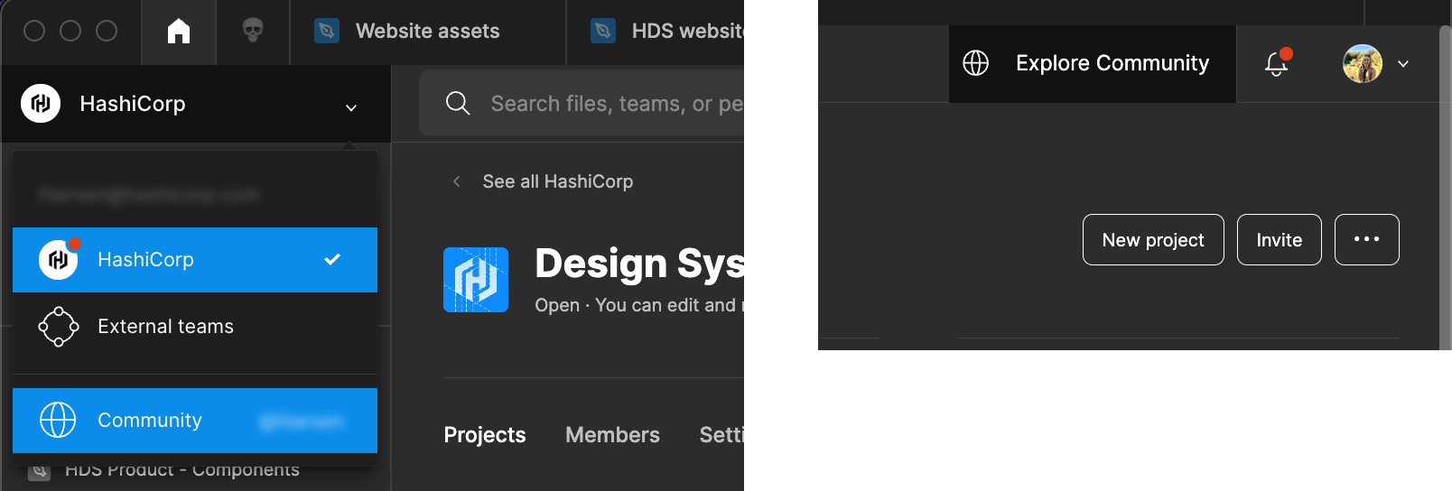
The Figma community contains other useful resources for documenting your designs, wireframing, and collaborating with your team. Access Figma's community by clicking the organization switcher in the dashboard and selecting "Community" or by clicking "Explore Community" in the toolbar.
Figma documentation
Explore more content about libraries, components, and styles directly from Figma.
- Guide to libraries in Figma
- Organizing and creating libraries
- Apply styles to layers and objects
- Guide to components
Support
If you have questions or need assistance using Helios libraries, contact the Design Systems Team.